
GlowTime - mobile application for booking visits to beauty salons
Users of beauty services often find it difficult to book: many disparate methods are used - cards, calls, social media. This makes it difficult to find venues, to learn about services and examples of work, and to manage bookings.
My goal is to develop an application that integrates these processes and simplifies the interaction for users.
YEAR
August 2024
PLATFORM
Mobile app
ROLE
Product designer

How I organized the process
1. Target audience research
2. Competitor analysis
3. User scenario elaboration
4. Prototyping
5. Creating the final Ul design
In addition, the project
6. Additional details about the project
7. Errors have been addressed and edits have been made
8. Final conclusions are formulated
1. Target audience research
I identified the target audience, drafted interview questions and conducted a survey. Based on the analysis, key insights were identified:
Ease of reuse
Users are not looking for a standalone record app, it's important to offer added value (loyalty system, record history).
Implementing an appointment reminder system after one month.
Flexibility and personalization
Ability to choose a convenient notification channel (mail, Telegram, WhatsApp).
Calendar integration to select the nearest available specialists.
Filters and sorting
Simplify your search for professionals by experience, reviews, work examples and distance.
Display masters on the map.
Recommendations and reminders
Offering popular services and ideas based on user preferences.
Transparency and trust
Real reviews, retaining “select” craftsmen.
Convenience of booking
Real-time calendar updates.
Intreview with TA

2. Competitor analysis
I analyzed direct competitors and apps with similar booking mechanisms, highlighting their advantages and disadvantages.
Direct competitors

Fresha is a platform for recording and managing your beauty business.

Square Appointments is a tool for recording customers and accepting payments.
Similar applications

Zocdoc is a service for doctor's appointments.

PeerSpace event space rentals.

Monzo is a digital bank with financial management features.

Natural AI is a generative interface developed by [Brain.ai](http://brain.ai/) that simplifies interaction with technology.
Conclusions from the analysis
A fixed booking button provides access to bookings at any time, improving the user experience and reducing the risk of an abandoned session.
Value-added services allow you to offer options to customers, increasing the average check and making the process more personalized.
Selecting a specialist and time on one screen simplifies booking, reducing steps and errors, which increases customer satisfaction.
Entering a promo code encourages discounts and promotions, increases customer loyalty and attracts new bookings.
Instantly displaying slots reduces search time, increases transparency, and minimizes switching to competitors.
Key information about an establishment allows you to quickly evaluate an establishment, increasing trust and simplifying decision making.
Active Reservations simplifies booking management and enhances the usability of the app.
Direct competitors

Similar applications

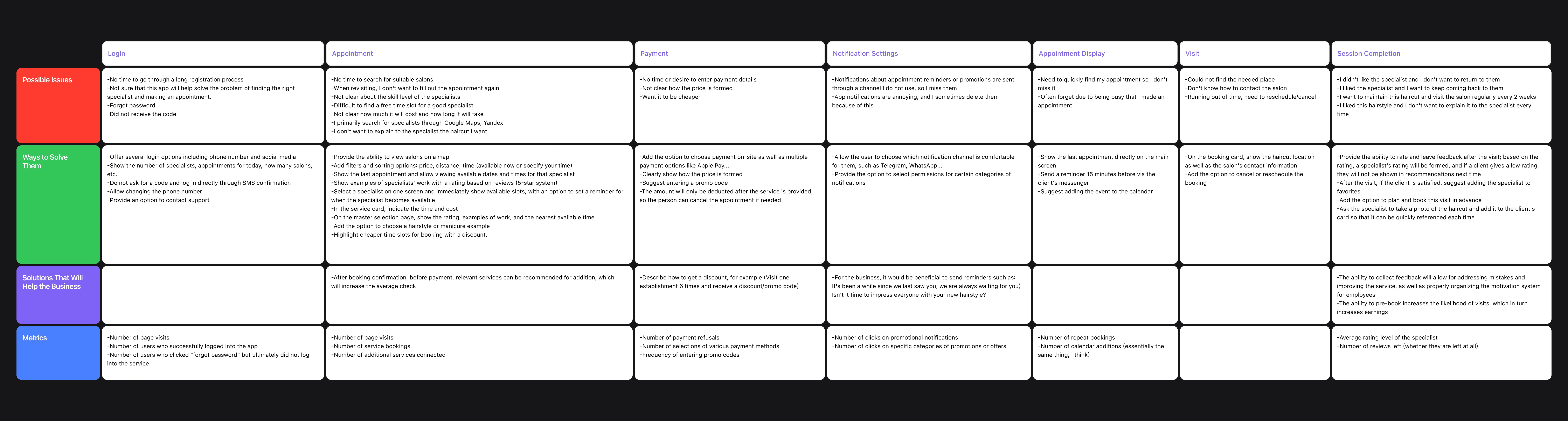
3. Developing a user scenario
Based on the analysis, a detailed user scenario was developed, including the key steps of the interaction.
For each stage, I defined metrics so that the effectiveness of the implemented solutions could be measured in the future.
Simplifying the entry process
The introduction of multiple login methods (phone, social networks), login via SMS confirmation without a code and the ability to change the phone number help to reduce barriers at the registration stage.
Metrics
The number of users who successfully logged into the app.
Optimizing the booking process
Map search functionality, filters (by price, time, rating), examples of masters' work and transparent display of service cost allow users to find the right specialists faster and more conveniently.
Metrics
Number of records for the service.
Number of connected additional services.
Transparent pricing and ease of payment
Clear price formation, the ability to pay on the spot and support for popular payment methods (e.g. Apple Pay), as well as the use of promo codes increase user confidence.
Metrics
Number of fee waivers.
Promo Code Entry Frequency.
Personalized notifications
Being able to select convenient notification channels (Telegram, WhatsApp, etc.) and categorize them helps avoid annoyance and increase their usefulness.
Metrics
Number of conversions on share notifications.
Improved management of current bookings
Displaying active entries on the homepage, reminders 15 minutes before a meeting, and the ability to add an entry to your calendar make interactions more organized.
Metrics
Number of repeated entries.
Number of reservations canceled and rescheduled.
Increasing customer return
Scheduling regular visits, reminders of long-standing appointments, and personalized offers motivate customers to return.
Metrics
Number of repeated entries.
Optional: Increase in average check
Recommending additional services before payment and highlighting available discounts encourage users to make more bookings.
Metrics
Average reservation check.
Scenario development
4. Prototyping
After analyzing the findings, I refined the structure of the required screens, which allowed me to efficiently begin prototyping key elements.
Screenshot from Figma
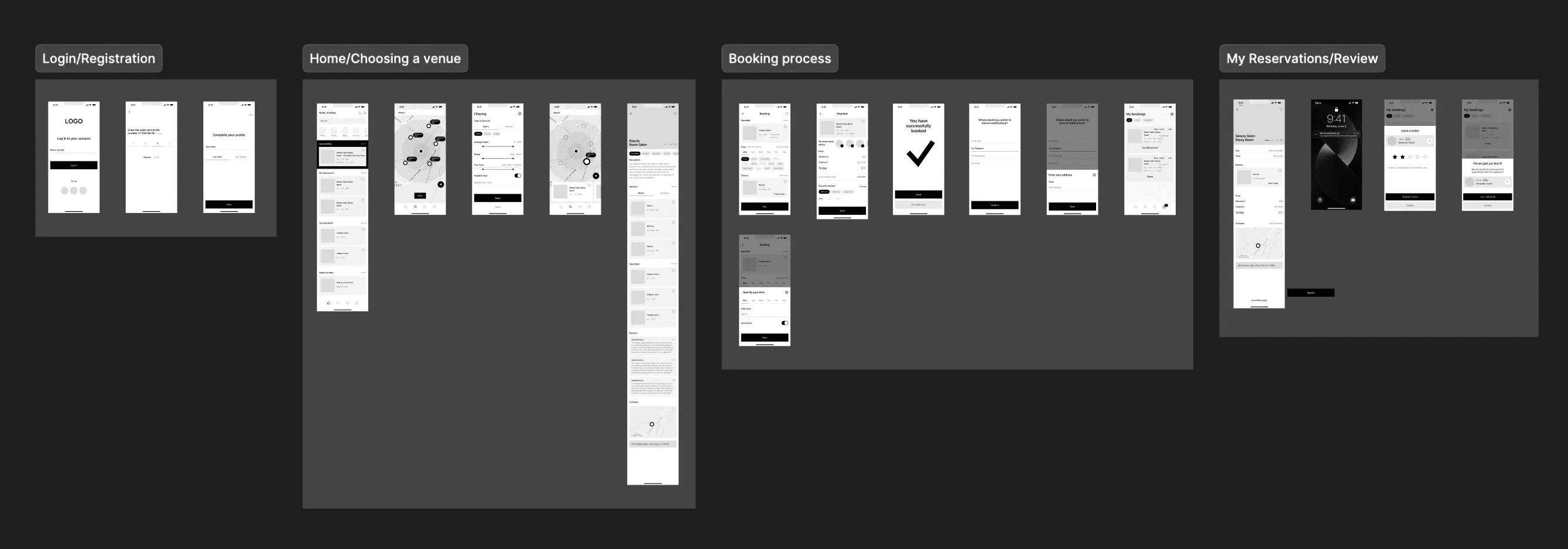
5. Drawing of the final UI
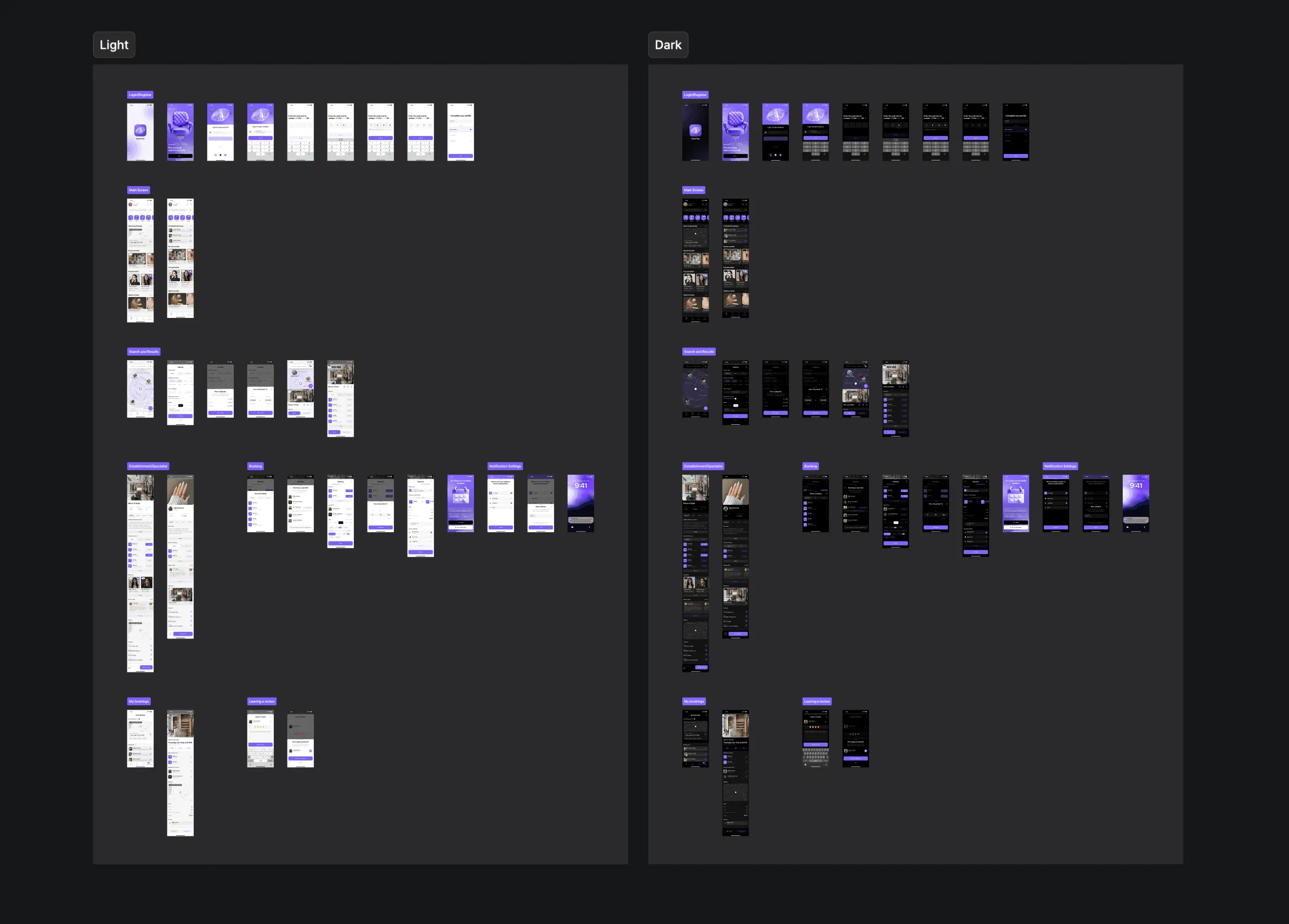
Login and registration screens
Created informative screens with a simplified login and onboarding process.

Home screen
Contains quick access to basic functions: selecting a service, viewing recent bookings and other prioritized scenarios.

Search screens
Make it easy to filter and find the right institutions and professionals.

Facility and specialist screens
Display key information that influences the choice (testimonials, experience, examples of work).

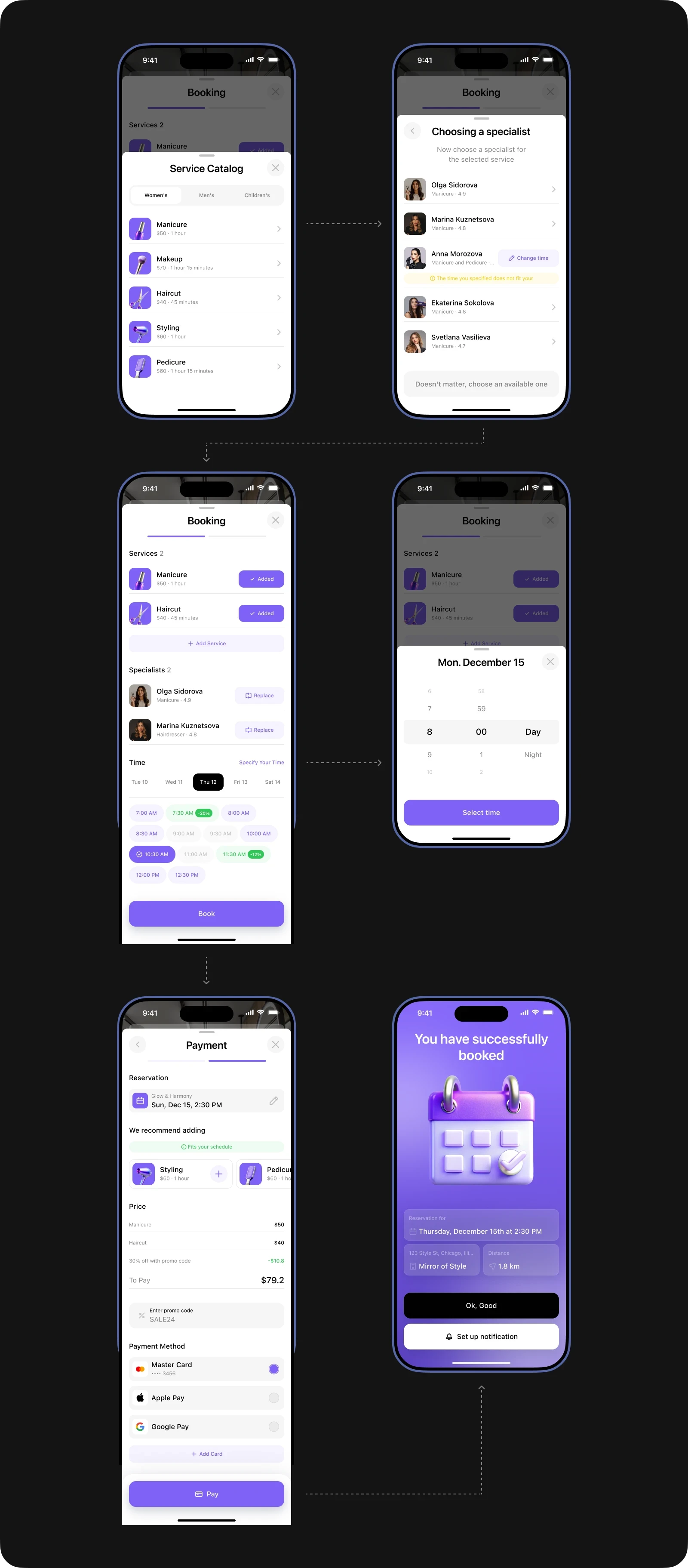
Visit booking screens
Show a transparent process and allow you to control the process at every step.
Notification settings
It is up to the user to choose where to receive reminders.

Section My Reservations
Allows you to edit current records and view history.

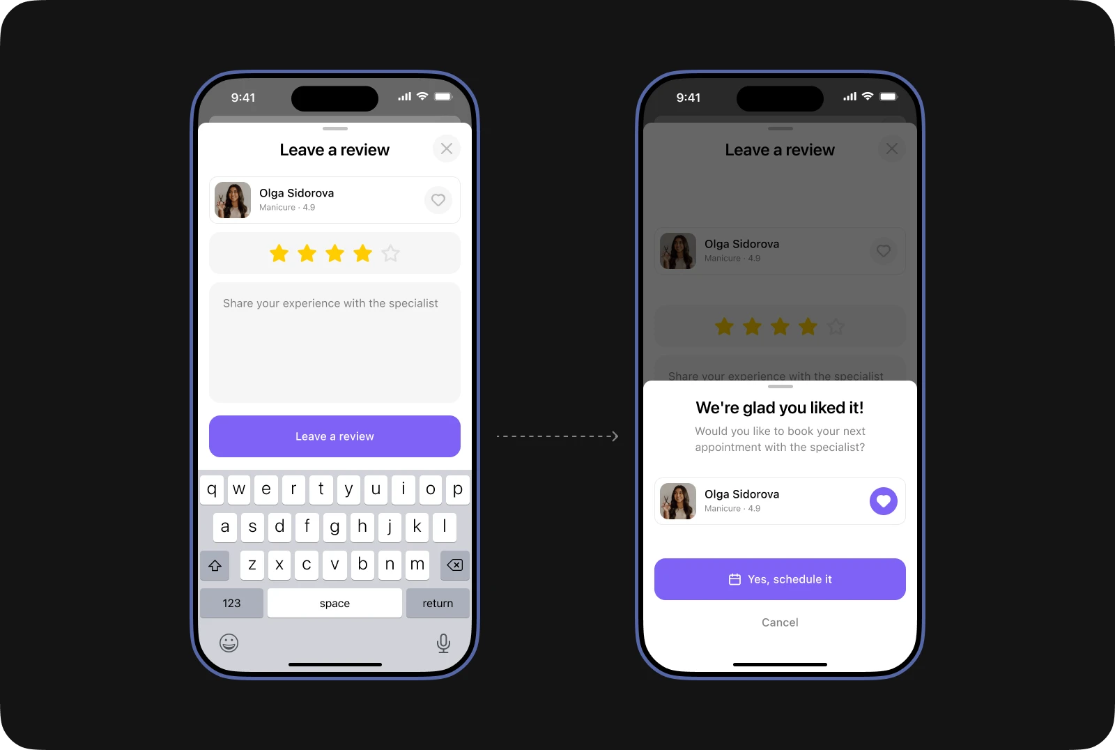
Screens of leaving a review
After the visit it is suggested to leave a review or add the master to “favorites”.
6. Additional details about the project
Created Naming and Logo
The name GlowTime (“Time to shine”) emphasizes the theme of beauty. The logo in the form of a diamond was created in a 3D editor.
Created a UI Kit with all the necessary components and states

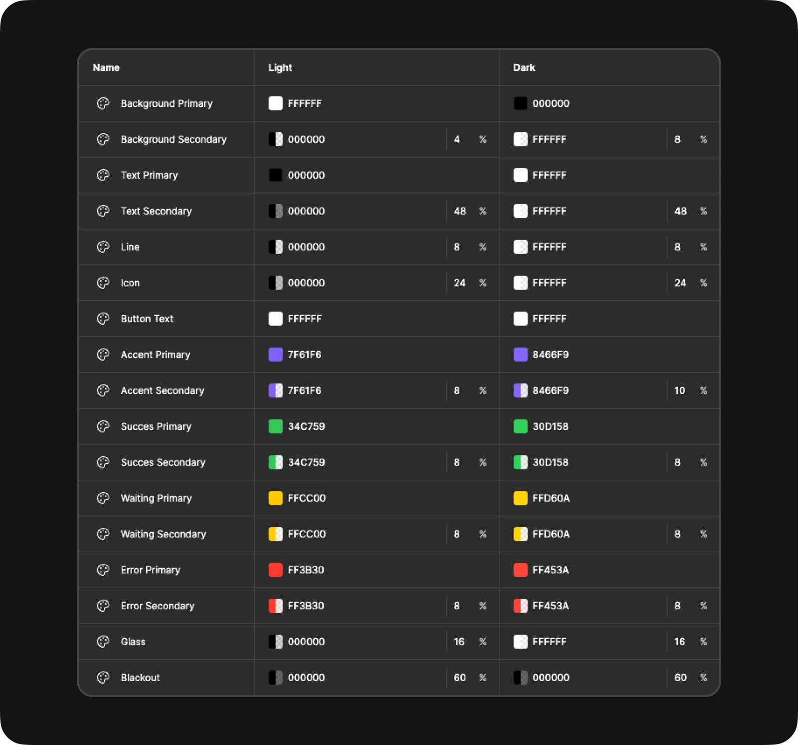
Created a thoughtful color palette for the light and dark theme
Minimalistic black and white colors with variation in transparency are used. This allows to create visual depth without loss of contrast and redundancy of styles.
Made a dark theme for all screens
7. Errors have been addressed and edits have been made
After analyzing the findings, I refined the structure of the required screens, which allowed me to efficiently begin prototyping key elements.
Previous version
In the previous version of the process, the user was required to first select a service and then separately assign a specialist to each service. If a specialist was not selected, the system notified the user to make a selection.

Corrected version
In the updated version, the process has become more convenient: when selecting a service, the next step is automatically offered to select a specialist, which eliminates the need to open an additional window for this action.

8. Final conclusions
While working on this project, I immersed myself in a new sphere for me and took into account all the nuances of the beauty industry. This allowed me to maximize the detail of user scenarios and create a solution that effectively solves the main problems of users.
Metrics for performance evaluation
I propose to use the following metrics to evaluate the effectiveness of the implemented solutions:
Number of repeat bookings
you can measure the percentage of users who return to the application to record again
Average time to complete a booking
Tracking the time a user spends from opening an application to completion
Increase in the number of new users
metrics for attracting new customers through organic traffic or referral programs.
Conversion from the home screen
the percentage of users who made a booking out of the total number of visitors to the home screen.
These metrics will help you objectively evaluate the success of the product and identify points for further improvement.


