Scholaro – Admissions Dashboard Optimization
Independent UX Exploration
Scholaro is a credential evaluation platform that helps institutions assess international academic degrees and determine U.S. equivalency.
This exploration focuses on the Applicants Dashboard — a core operational tool used by admissions teams to review and process high volumes of applications.
I selected this area because it directly impacts decision speed, prioritization, and operational efficiency.
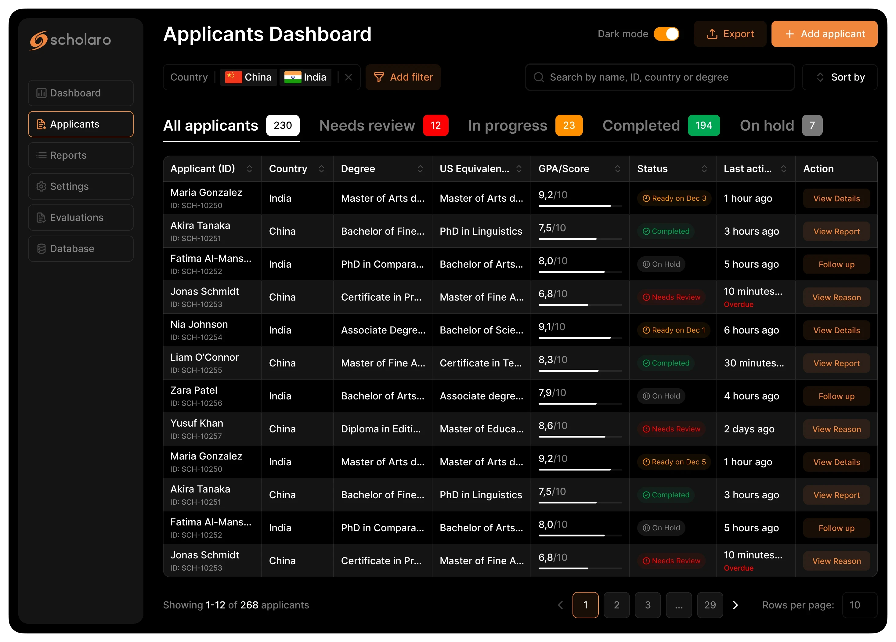
The goal was to surface decision-critical data directly in the list view and reduce friction in triage workflows.
YEAR
February 2026
PLATFORM
Web Application (B2B SaaS)
ROLE
Product Designer (Independent UX Exploration)

Original Applicants Table (Publicly Available View)
Due to limited access, I analyzed the publicly available demo and documentation screenshots.
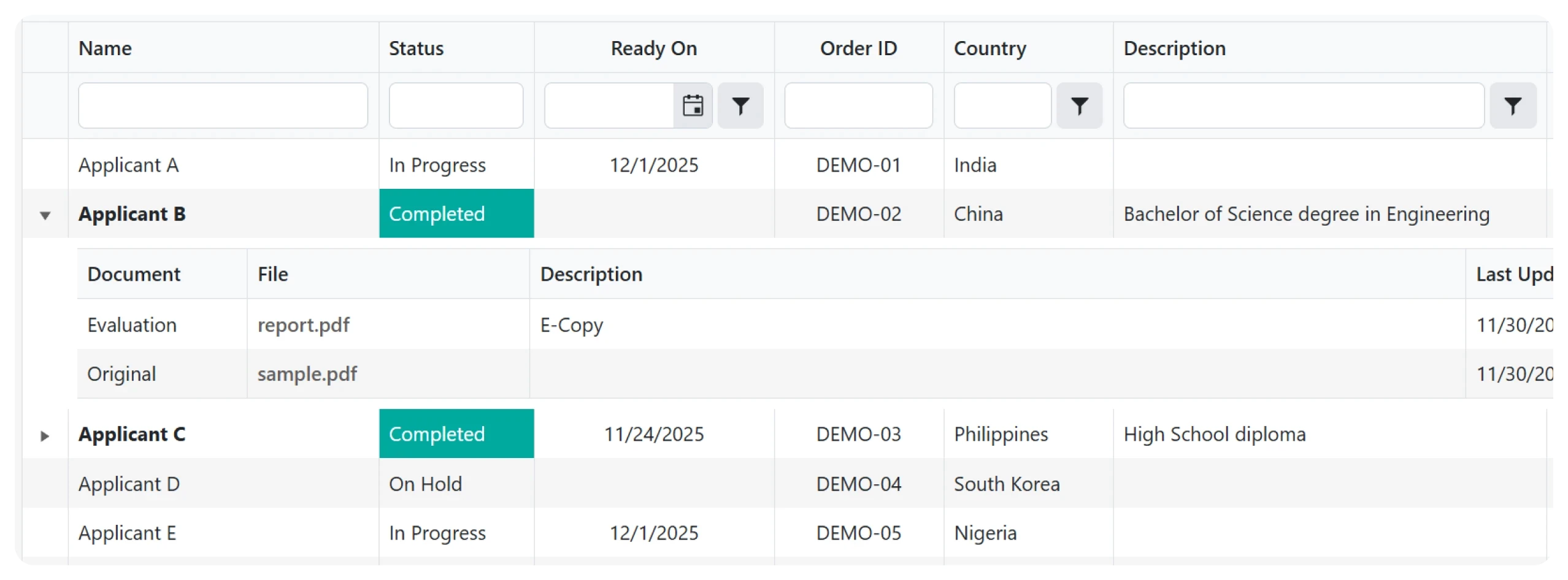
What I observed
• No instant workload overview
• No visual prioritization
• Core decision data partially hidden
• GPA and equivalency require deeper navigation
• Status and readiness logic mixed
Key Insight
The interface is functional, but optimized more for data storage than operational decision speed.
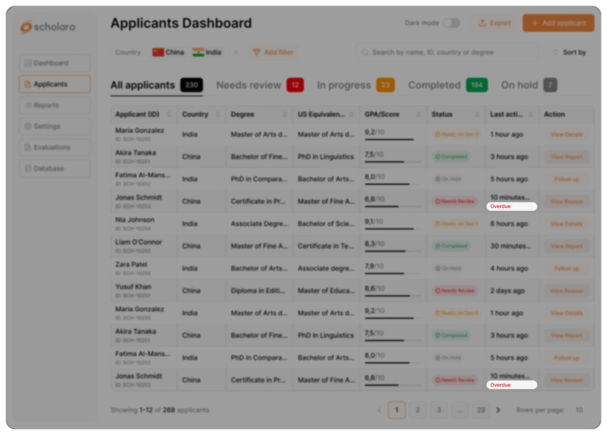
Redesigned for Operational Efficiency

Design Goal
Shift from data display to decision-driven workflow.
What Changed
• Added interactive KPI overview
• Surfaced GPA and US equivalence
• Introduced contextual actions
• Visual prioritization (status + alerts)
• Preserved readiness dates within workflow logic
Outcome
• Faster scanning
• Reduced cognitive load
• Improved prioritization
• Higher decision confidence
KPI SUMMARY CARDS (Interactive)
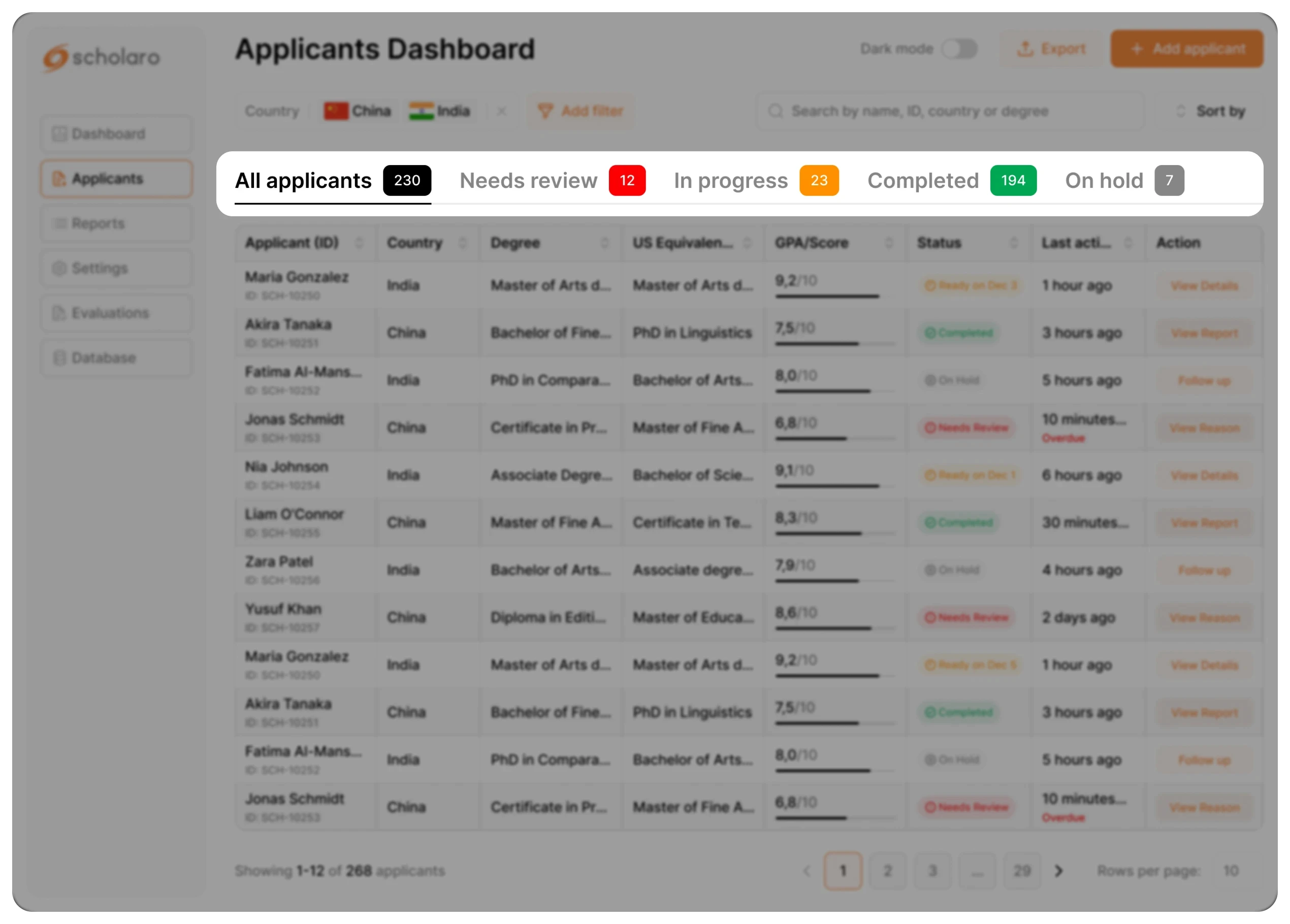
Problem
Users do not have an immediate overview of workload and must manually filter cases.
Solution
Added interactive summary cards for:
• Needs Review
• In Progress
• Completed
• On Hold
Each card also acts as a one-click filter.
UX reasoning
Combines visibility and interaction in one element.
Reduces navigation steps and supports recognition over recall.
Business impact
• Faster workload assessment
• One-click prioritization
• Reduced filtering friction
• Increased operational efficiency
GPA Visibility Enhancement
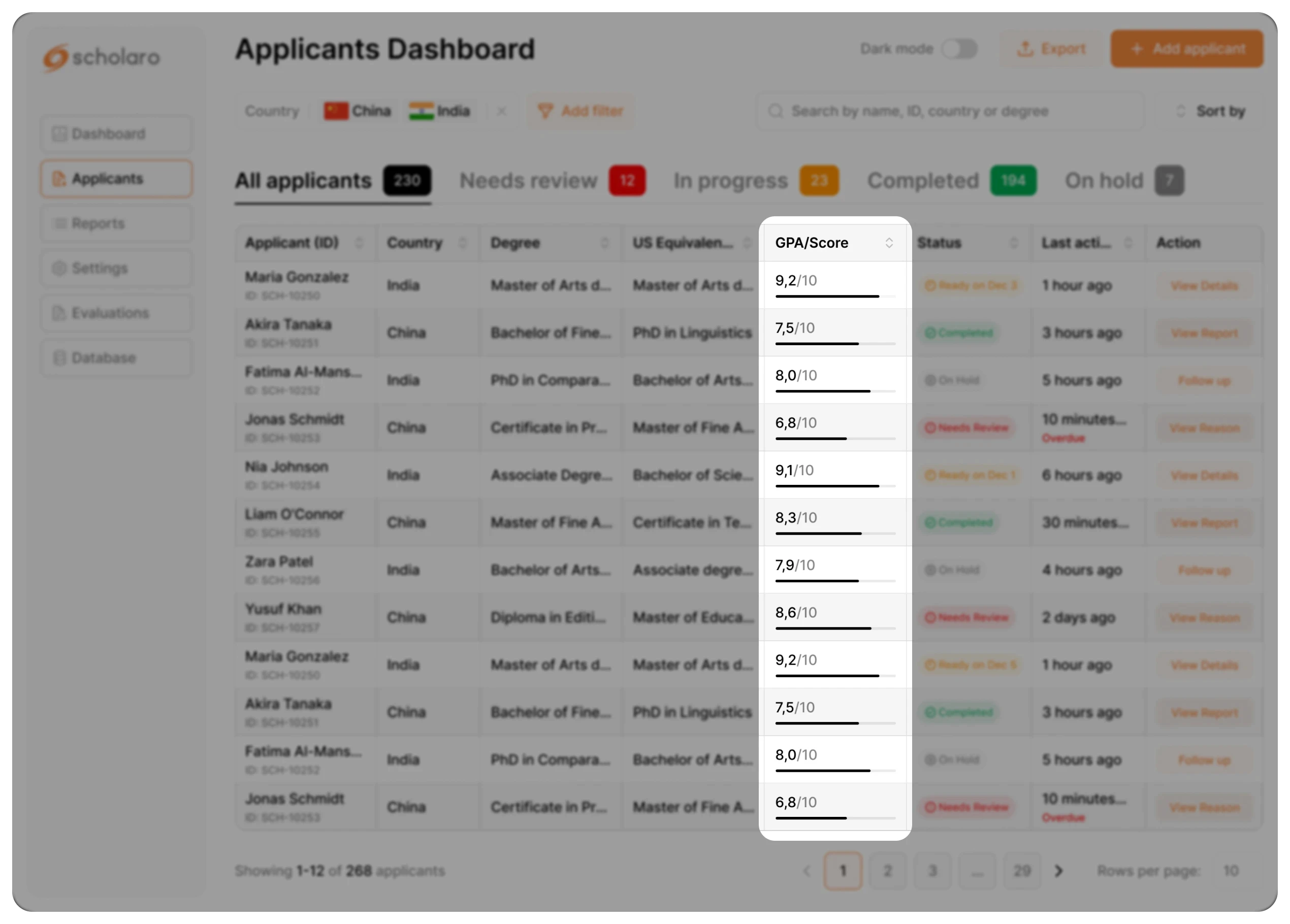
Problem
GPA required opening reports and numeric values were hard to compare quickly
Solution
Surfaced GPA directly in the table and added a visual comparison bar.
UX reasoning
Reduces interaction cost and supports faster visual comparison across applicants.
Business impact
• Accelerates shortlisting decisions
• Reduces report-opening dependency
• Improves evaluation throughput
• Supports high-volume review efficiency
STATUS BADGES REDESIGN

Problem
Status states lacked strong visual hierarchy.
Solution
Redesigned status badges with consistent color coding.
UX reasoning
Enhances scannability and pattern recognition.
Business impact
Shortens decision latency per applicant.
ALERTS / OVERDUE INDICATOR
Problem
Critical or overdue cases could be overlooked.
Solution
Added visible alert indicators in list view.
UX reasoning
Supports error prevention and attention direction.
Business impact
Reduces operational risk and missed deadlines
LAST ACTIVITY VISIBILITY

Problem
Users lacked context about recent updates.
Solution
Added timestamp and activity context.
UX reasoning
Supports informed prioritization.
Business impact
Improves response time and coordination.
SEARCH OPTIMIZATION

Problem
Applicant retrieval was inefficient.
Solution
Unified search across name, ID, country, and degree.
UX reasoning
Reduces cognitive switching between filters.
Business impact
Saves operational time at scale.
Final Reflection
This redesign focuses on operational clarity and decision efficiency.
By reducing cognitive load and surfacing decision-critical data directly in the list view, the dashboard supports faster and more confident evaluations.
Small structural improvements in high-volume workflows can generate measurable efficiency gains at scale.
I also introduced Dark Mode to support extended review sessions and reduce visual fatigue.
This is the mindset I bring to product design.